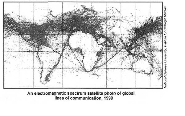
Lex found the following image here.
He posits a quiz question: Can you identify Core, Gap, Emerging Core from this graphic alone?
Some Chicago Boyz know each other from student days at the University of Chicago. Others are Chicago boys in spirit. The blog name is also intended as a good-humored gesture of admiration for distinguished Chicago School economists and fellow travelers.
Lex found the following image here.
He posits a quiz question: Can you identify Core, Gap, Emerging Core from this graphic alone?
Comments are closed.
Great, great graphic. Thank you. It does bring up a chicken-and-egg question. As I mention in my link here, I wonder what a color-coded version of this map (by nation of ownership) would show?
To what extent are satellite-based communications shown in this image?
Cool picture!
Lex, “Can you identify Core, Gap, Emerging Core from this graphic alone?”
Allowing for disparities in the population densities of the desert and mountain regions of “Core” countries, like Australia and Chile, yes, you can. “Emerging Core” countries that inhabit archipelagos, like Indonesia, are not so clearly defined.
-Steve
Steve, I agree. Taking the fact that some places are just empty, you can see the “connectivity” density in the Core areas very clearly as dense black, where coastal India and China, which are New Core are less dense.
plus, this image is from ’99. A cuurrent image might already show some changes in ’emerging core’ areas.